

")


We’ve released a Product Adoption GPT for you to ask questions. Its free to use for any ChatGPT Plus user and answers with quality advice
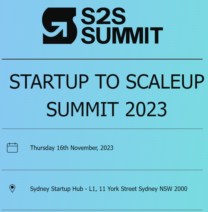
Sydney, Thursday 16th November 2023 – Contextual, a pioneering force in Product Adoption, is thrilled to announce its participation as an exhibitor at the first

Introduction In a world grappling with economic uncertainties and slowdowns, mobile consumer spending has emerged as a surprising beacon of hope. Despite the ominous signs

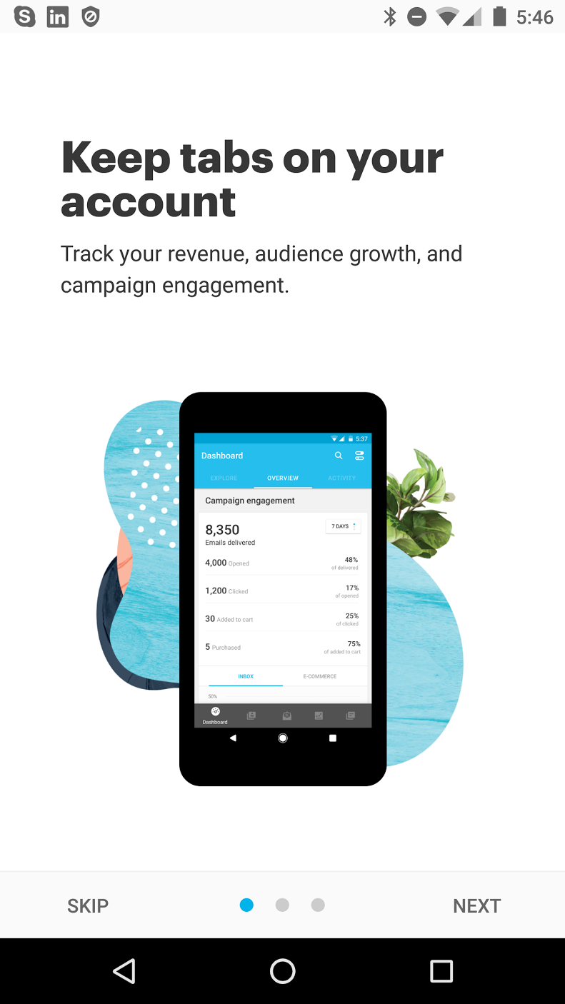
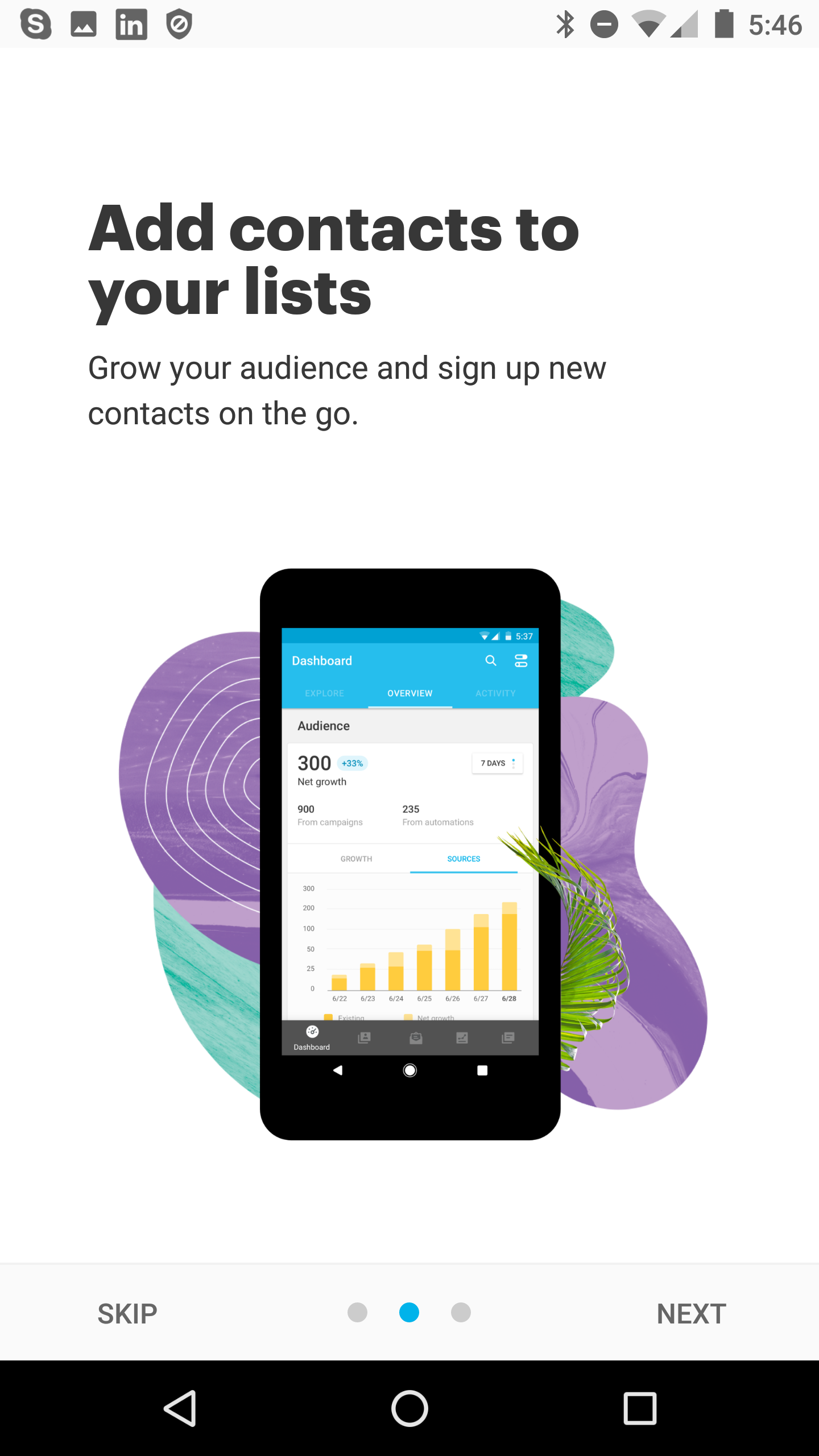
For mobile app user onboarding carousels used to be a thing but what about now? Carousels (also known as sliders or onboarding screens) were still